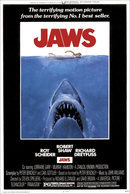
Thirty-four years ago, I saw Jaws for the first time. My grandmother took me for my birthday, and nothing’s been the same since. Actually, the impact began before I saw the film in ’76. It really started the summer before with the outrageous hype and this poster…
This legendary image actually began as the paperback’s cover, drawn by Roger Kastel, an artist under contract with Bantam Books. If you look closely—and you don’t even have to look that closely—you can see that the woman (“Chrissie” from the opening of the book/film) is pretty damned naked. Besides seeing the film for my seventh birthday, I got the soundtrack, too, and would listen to it under (big) headphones while staring endlessly at this cover. In fact, for my birthday party that year, I snuck several of my guy friends into the bathroom so I could clandestinely show them the naked woman on the cover—but then my mother busted in and broke us up. (How did she know?!)
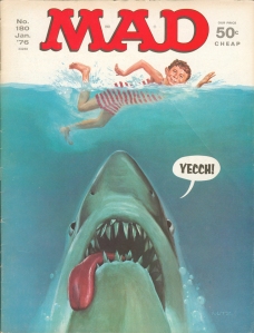
As a kid who loved humor as much as movies, the inevitable Mad magazine cover was equally as important in my early years. (Hell, I knew their parody, Jaw’d, months before I saw the film.)
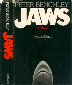
But there is other artwork for Jaws worth noting. First, the original 1974 Doubleday hardcover takes a little thunder away from the iconic movie poster. This is clearly more esoteric, but the basic notion is already in place. Also, it too has the fishhook “J.” Lastly, unlike Kastel’s painting, this one evokes a night attack, which adds an extra chill to it. (It’s a shame no artist is noted on the dustjacket.)
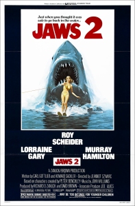
In 1978, Jaws 2 arrived, and so did this lame-o poster. This took a great thing and made it stupid. I mean, sure the original was hyperbole, but this one was just plain dumb. I knew it even at the age of nine.1
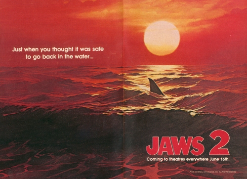
What was a real drag, however, was that Universal Pictures didn’t stick with their teaser campaign…
Not only did it have the best possible tagline (that film’s only legacy), but it had a new look: Evil was reapproaching and it was all red, red, red. I saw this in TV Guide a month before the film was released and it knocked the wind out of me. It’s a shame Universal chickened out and played it safe, poster-wise.
Of course, this notion of Universal selling the viewer short has continued. If you read my first post, you know the disdain I have for the re-mixed Jaws on DVD. But my anger covers more ground than that. Have you seen the DVD cover artwork? Check it out…
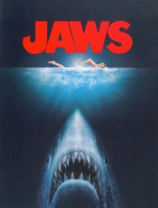
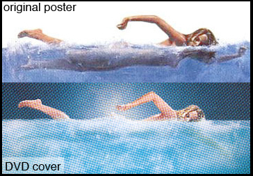
It’s shiny so it doesn’t scan so easily. Therefore, I’ll point out the discrepancies between this version and the original it’s based on. The differences between the sharks are silly and almost negligible. The new shark is much more robotic and less defined. It’s more like an arrowhead and less like a fish. The eyes, however, are more lifelike but they look like they’re crossed. Also, they added some teeth to his upper jaw; I guess he wasn’t menacing enough in the original poster.
But it’s Chrissie that gets the most damage:
Besides the fact that they changed the position of both her arms (why?), they also added enough foam to remove any hint of her naked body below the surface. I could go on about the ugliness of PC revisionism, but what’s the use? I can’t figure these people out. The poster in its original form was perfectly fine promotion for 30 years, for the paperback, the film, the soundtrack, the VHS tape, etc., so why change it?
I will say this: that little bit of tease in the poster, as slight as it might be, happens below the water’s surface, and I always thought that’s what draws the shark: It’s what he sees. (It’s worth noting that the tagline for the film was “She was his first.”) So if you obliterate that detail of her body, obscure it with foam, well, it removes a layer of horror, the psycho-sexual kind. And you may remember that Chrissie’s death in the film also has plenty of sexual overtones.
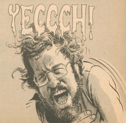
So all that new fancy packaging gets us is a shiny, cross-eyed robot-shark staring at a sexless, glowing foam-creature. Hmmm…It makes me think of a reaction from “Clod Hopper,” Richard Dreyfuss’s character in Mad magazine’s Jaw’d:
________________________________________________________
BACK TO POST 1 For what it’s worth, I think the cover of the Marvel Comics tie-in with Jaws 2 hit the nail on the head.


I recently rewatched jaws and hadnt realised just how much you do see! It does seem very odd to self censer like this.
Chrisse disrobing before plunging into the water brings me to Janet Leigh is Psycho. I’m not sure how many movie women met their demise after taking their clothes off and jumping in, but these deaths two of the most horrifying I can think of.
One woman, Ripley from Alien, goes onto this as well. She’s woefully vulnerable in the escape ship to begin with, but when she undressea to put on the space suit, it brings her into another realm of vulnerabilty. Ripley, however, wins becaue she manages to pull it together and jettison the alien from the ship
Pingback: Link-By Posting From Nashville | Movie News Blog
I agree–“Just when you thought it was safe to go back in the water…” is the greatest movie tagline ever. *And* I also remember the teaser poster in TV Guide. What a glorious image, the blood-red ocean in the setting sun…
You forgot one “Jaws 2” advert pic they used on the soundtrack, it was based on Eddie’s death scene, when he and Tina were attacked in the sailboat, that pic used the original Roger Kastel shark head from the first one. I always thought that advert was alot better than the waterskier advert.
Hi. I didn’t forget it, per se, just ran out of steam!
But I def. agree with you that that one’s better than the waterskier one. If they had to ditch the red theme, then I wish they would have stuck with the boat one instead of one that’s sadly ludicrous.
Pingback: The terrifying motion picture from the terrifying No. 1 best seller. « Peel Slowly